|
|
 C&C Appreciated 
|
//Latest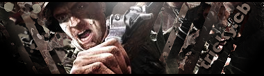 ]
//Favorite
//tricky.cb
|
|
|
|
|
|
Colouring: Greatly done.
Blending: Also, done well.
Smudging: Also very well done.
Text is also great and matches well imo.
The only thing i really think that is wrong, is i think the guy is too dark, he needs to be a little lighter... Cant see him all that well xD
|
|
|
|
|
|
Overall, the colors blend in nicely, but I'm not to keen on the flow here. It certainly could do some work.
The smudging looks good here within the background, and rest of the picture besides the primary render stands out as well. However, the smudging gets in the way with the rest of the background, which makes it terribly unclear where the render is, or how you are trying to portray him with the rest of the background.
Your primary render could do with a bit more lighting in specific area where the light is supposed to shine, but the helmet area barely has any shining, which is why overall the entire figure looks too darkened, whereas it's really only the helmet.
Lastly, make the text tricky.cb stand out a bit more.
Good luck in the future.
|

|
|
|