|
|
Just fooling around with CS2, came up with this (which I made into a gift for Brian Silver): 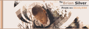
|
|
|
|
|
The forum doesn't load for me, still. All that shows, are the Proboards ads, and an "XL" banner.  I use IE7, btw.
|
|
|
|
|
|
First thing's first, remove that flash video from your forum, cos the rest of the forum doesnt load at all.
|
|
|
|
|
None Sharpened:  Sharpened: 
|
|
|
|
|
As i said before, the only thing i really dislike, is the banner. Its a good design, but it has a few flaws in my opinion. 1) It needs to look 3d, not 2d, this will make it flow and match much better with the rest of the design, 'cos the other images are mostly all 3d. 2) The PM icon to the top right has a dark bg to it, and its a gif, so its not cos its a png. It looks silly with that bg cos it overlaps onto the other parts of the banner, just make it like the "V5" 'button" thats to the top left of the banner. There are many transparent png's you have, and to be honest, im not even gonna complain about them, ive had enough of complaining, i will just put up with transparent png's from now on  Oh and one last thing, im not liking how the bottom part of the border is a rectangle, sort of.. I mean, it should be rounded edges or something, or somethign else to match the banner, cos this just looks rushed and stupid as it is to be totally honest. I would definitely try revamp that if i were you.
|
|
|
|
|
Im trying to get back into tags but am failing miserably lol xD 
|
|
|
|
|
|
Havent done a sig in a long while.. I couldnt get it in color right, so i greyscaled it. 3 variations, with small differences. The 1st sig takes a few mins to load, for me at least.   
|
|
|
|
|
|
Loving the first sprite, not keen on the second though.
The effects for the second though really flow well with the sprite.
|
|
|
|
|
First ever vector...  I started out with one music note, then i worked from that, and tried to make a sig to match it.. xD
|
|
|
|
|
Well, the base to me, looks a bit choppy, and the white folder icons are a big no no, so they are a must to change xD Other than that all looks good 
|
|
|
|
|
np just gotta open psp now xD
|
|
|
|
|
I suppose i could give you this one, when i next open PSP, i will remove my name, add yours and recolor it for ya 
|
|
|
|
|
Well, i tried an abstract tag with a person on. Im not the kind of person who usually does tags with people, characters etc on xD  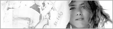
|
|
|
|
|
|
lol thanks..
There are some green parts near the bottom left that look odd, but meh lol..
|
|
|


